Rebranding Spotify
11/2021 - 05/2022
Assignment:
For the subject UX and the subject UI we had to redesign an app. We could chose between: Strava, Spotify, Snapchat, Tik Tok and Tinder.

Result:
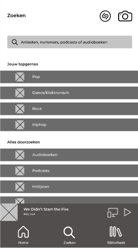
UX Low Fidelity frame
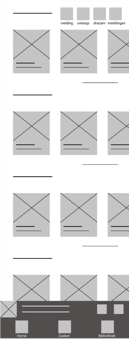
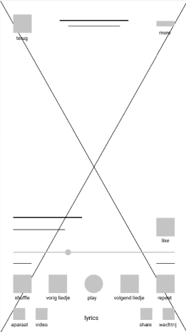
I chose to rebrand Spotify and after doing some research about the features of spotify and asking people about their pain points with spotify I made a really basic design about how I think spotify can change some things in their UX.

UX High Fidelity frame
After that I made it a little bit more clear by adding icons, ...

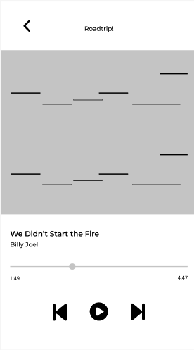
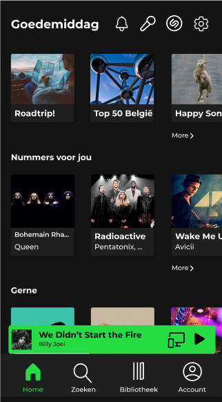
UI mobile
When all the UX was done I began making the design for it. The design of spotify was on that moment really good so I didn't want to change a lot about it.



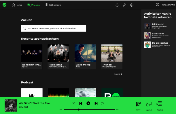
UI desktop
We also needed to make 2 screens in desktop so I based myself a little bit on how Spotify is on desktop on this moment but changed it a little bit.

